

WHM new design - WHY!?!?!
 bikegremlin
ModeratorOG
bikegremlin
ModeratorOG
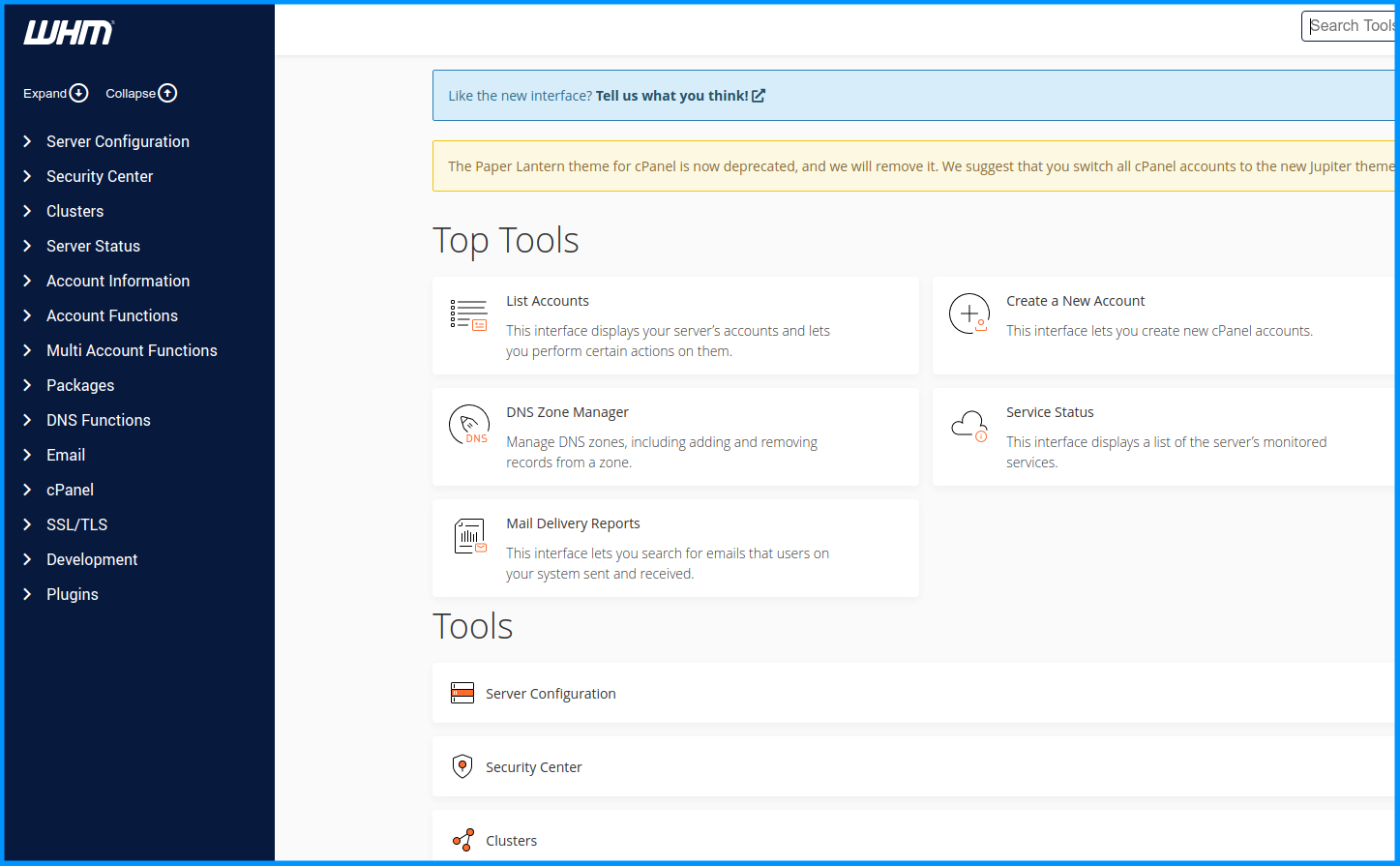
Well, here's what it looks like now:
Another reason I'm glad for having switched to DirectAdmin - in spite of its downsides. ![]()
This new interface seems quite unintuitive and, well... poorly designed.
Or I'm just too old (one not excluding the other ![]() ).
).

Detailed info about providers whose services I've used:
BikeGremlin web-hosting reviews
Comments
Directadmin interface also does not shine, but whm... Damn, that's just wall of text. They are going downhill so fast :-/ . Sad, I always loved whm ui/x
And the new, soon to be "obligatory" (the "Paper lantern" is being deprecated), "Ur-anus..." erm, I mean "Jupiter" theme for the cPanel!
Detailed info about providers whose services I've used:
BikeGremlin web-hosting reviews
For those using a mobile phone with these, they are more mobile-friendly. So there's always a bright side.")
Detailed info about providers whose services I've used:
BikeGremlin web-hosting reviews
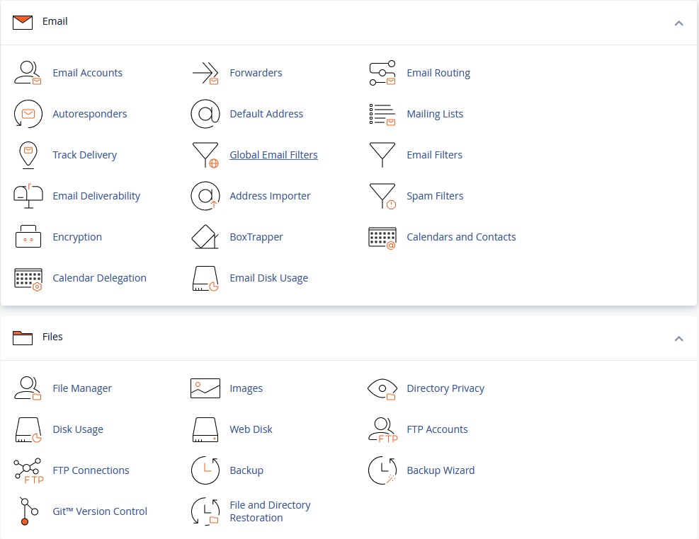
If they added those icons from WHM to the new cPanel theme it'd be a lot better. Icons make it so much quicker to skim and find what you need.
🦍🍌
Cpanel does have icons for me:
I guess WHM/Cpanel wants to refresh their "dated", but very functional UI. I somewhat dislike their new WHM search function.
I think something is broken with your design. I got icons and everything which makes it look just like a bit darker paper lantern design. What I don't like is the design break to the file manager and other functions. Apart from this maybe not as good as the paper design but still better overview than directadmin.
My cpanel with jupiter looks like bikegremlin's, except with small orange icons next to email and files headings (but not inside the submenus). At least that's how it looks in chrome (haven't tried other browsers).
Maybe it's related to Cpanel version... The screenshot was from 102.0.8.
Wow, that sucks. I'm more of an icon fan
PeekaBoo at https://handyhost.net
(Not affiliated with the Russian Handyhost Website in any way.)
This was the best design ever
Amadex • Hosting Forums • Webshop: Guide to Start Selling Online • Free Debit Card & Online Bank Account 🤑
slavicengineering
Detailed info about providers whose services I've used:
BikeGremlin web-hosting reviews
It's a thang! If it's not new and shiny then it's crap, regardless of functionality.
Y'all brought it on yerselves by using mobile devices for admin.
It wisnae me! A big boy done it and ran away.
NVMe2G for life! until death (the end is nigh)